
This article was last updated on Jun 13, 2024, to add new examples and use cases for CSS Grid and Flexbox
Introduction
Flexbox helps in creating one-dimensional layouts through space distribution and alignment capabilities. Flexbox makes it easier to design responsive layouts without using float or positioning. It has made life much easier for people that use CSS.
Grid is a two-dimensional layout model that helps in creating a layout and aligning items in it. It offers a layout system with rows and columns, making it easier to design web pages without using floats and positioning.
Creating layouts with CSS can be tricky, and it's complicated by the fact that both Flexbox and Grid are used for designing the page layouts. This guide includes some differences between flexbox and grid. We'll see how to decide which one of these to use while designing a layout.
In this guide, we'll cover:
- Control of Child Elements
- Intrinsic and Extrinsic Sizing
- Box Alignment
- Behavior of Flexbox and Grid
- Use cases
- Performance Considerations
- CSS Grid Features
Prerequisites
- Fundamentals of CSS layout
- Basic understanding of CSS Flexbox
- Basic understanding of CSS Grid
Control of Child Elements
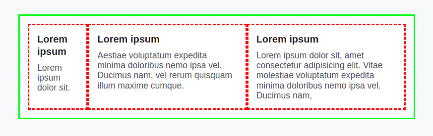
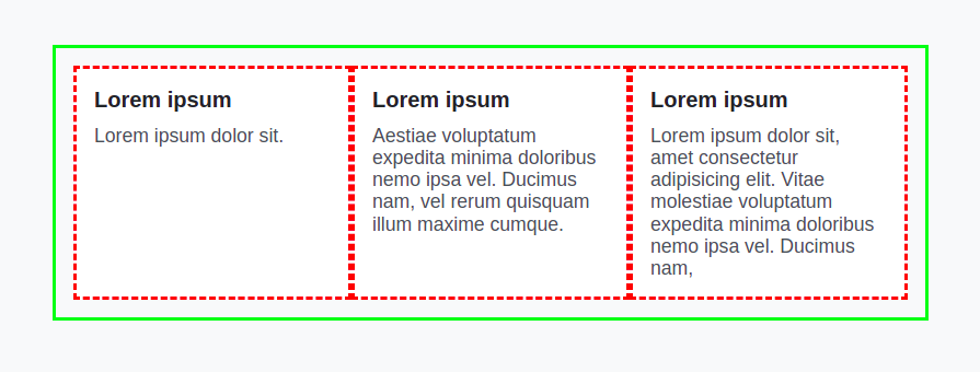
Flexbox gives children a lot of control. You have three child elements in the following example.
If you set display: flex, it creates a flex layout. You'll notice that you don't have three equal columns. It comes as a default with Flexbox when things are calculated for sizing.
<div class="parent">
  <div class="child">
    <h3>Lorem ipsum</h3>
    <p>Lorem ipsum dolor sit.</p>
  </div>
  <div class="child">
    <h3>Lorem ipsum</h3>
    <p>
      Aestiae voluptatum expedita minima doloribus nemo ipsa vel. Ducimus name,
      vel rerum quisquam illum maxime cumque.
    </p>
  </div>
  <div class="child">
    <h3>Lorem ipsum</h3>
    <p>
      Lorem ipsum dolor sit, amet consectetur adipisicing elit. Vitae molestiae
      voluptatum expedita minima doloribus nemo ipsa vel. Ducimus name,
    </p>
  </div>
</div>
.parent {
  display: flex;
  width: 100%;
  max-width: 50rem;
  margin: 0 auto;
  padding: 1rem;
  border: 3px solid lime;
}

.child {
  padding: 1rem;
  border: 3px dashed red;
  background: white;
}
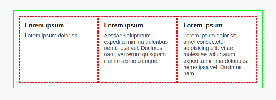
If you want to make three equal columns, you can't do this in a parent element. You need to do this in the child element as width:100% or flex:1. It will create three equal child elements in width.
Basically, child elements have control because the parent element delegates it to child elements in a flexbox. If child elements have equal content, they will be equal in size without doing width:100% or flex:1.
So, we need to be careful while using Flexbox.
Unlike Flexbox, a parent is completely in control of a grid. Let's create the above layout using a grid:
.parent {
  display: grid;
  width: 100%;
  max-width: 50rem;
  margin: 0 auto;
  padding: 1rem;
  border: 3px solid lime;
}
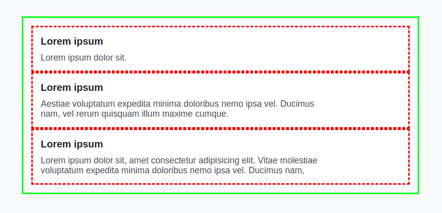
Nothing will happen if we change display: flex to display: grid You have to do something else to get things in the right place.
So, add this line grid-template-columns: 1fr 1fr 1fr in the parent element. Then, the content will fit into those columns that are created. When you create a grid, children of the grid fit into those cells.
Intrinsic and Extrinsic Sizing
In CSS, you have intrinsic and extrinsic sizing, like:
.intrinsic-size {
  width: auto;
}
.extrinsic-size {
  width: 500px;
}
It's a really important part of how layouts work in CSS. In intrinsic sizing, the browser figures out the size of an element.
In extrinsic sizing, you declare a specific width. Flexbox relies heavily on the intrinsic sizing of elements while growing and shrinking.
<div class="product">
  <img src="https://assets.codepen.io/308367/betteroutreach-logo.avif" />
  <div class="product__info">
    <h2>Product One</h2>
    <p>A collection of the best cold email templates ever sent</p>
    <div class="product__meta">
      <div>Free Options</div>
      <div>Email</div>
    </div>
  </div>
</div>

<div class="product">
  <img src="https://assets.codepen.io/308367/sliderule-logo.avif" />
  <div class="product__info">
    <h2>Product two</h2>
    <p>The no-code rules engine for risk & fraud</p>
    <div class="product__meta">
      <div>Free</div>
      <div>Social Network</div>
    </div>
  </div>
</div>

<div class="product">
  <img src="https://assets.codepen.io/308367/warmy-logo.avif" />
  <div class="product__info">
    <h2>Product three</h2>
    <p>Auto all-in-one tool to make your email channel reliable</p>
    <div class="product__meta">
      <div>Free Options</div>
      <div>Email</div>
    </div>
  </div>
</div>
.product__meta {
  font-size: 12px;
  outline: 3px solid red;
  display: flex;
  gap: 1rem;
}

.product__meta > * {
  border: 3px solid lime;
}

body {
  display: grid;
  padding: var(--size-9);
  align-content: start;
  gap: var(--size-9);
  background: white;
}

.product {
  display: grid;
  gap: var(--size-5);
  grid-template-columns: 5rem 1fr;
}

.product__info {
  display: grid;
  grid-template-rows: min-content;
}
Flexbox figures out content size in the first place. When you do display: flex, the element size is based completely on the size of the content.
If you display flex in the product meta, two columns will take width according to the content size. It will help in creating the desired layout. So, dynamic columns can fit into this layout.
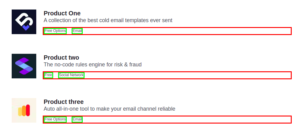
Unlike grid, where each column will take full width, or you need to specify the size in the parent element.
.product__meta {
  font-size: 12px;
  outline: 3px solid red;
  display: grid;
  gap: 1rem;
}
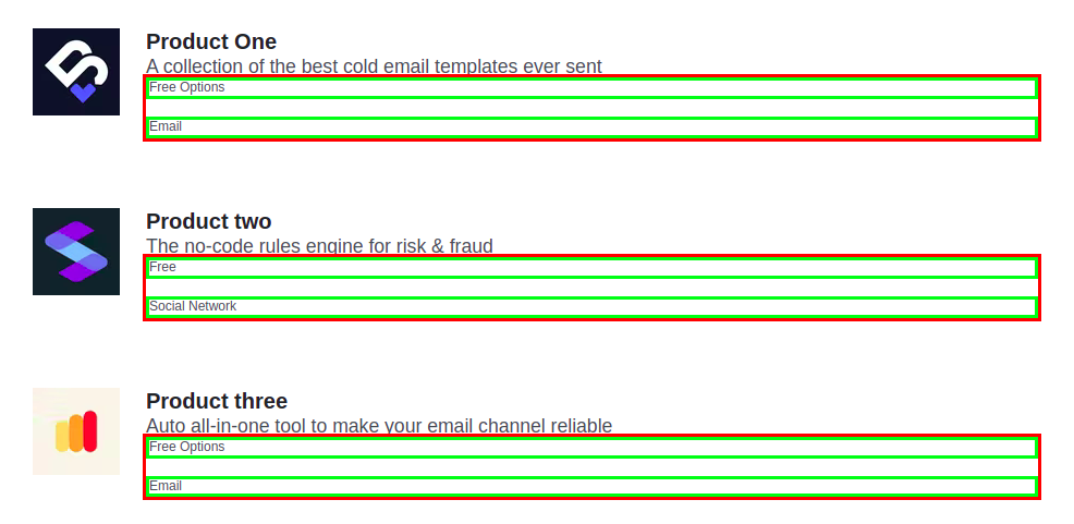
Hence, flexbox will provide more flexibility in this case. The grid helps in creating a more controlled layout.
Box Alignment
Let's not forget about box alignment. Because Flexbox holds the ability to align elements very easily. Before flexbox, it was very difficult to align items properly. Different hacks and tricks were used to align elements in the desired layout.
Flexbox can be used in a grid layout as well. Whenever you need to create a layout that has specific alignment or space distribution, you might want to go for a flexbox.
Behavior of Flexbox and Grid
Grid is useful in creating more complex and organized layouts. When you design the layout of a page, you can use a grid for the combined layout. Whereas flexbox helps in creating individual elements.
Since flexbox is based on intrinsic sizing, you can use flexbox when the layout depends upon the content. On the other hand, the grid is useful when content depends upon the layout.
Use cases
Flexbox can be a great to help align content and move blocks around and a great option for app components and small-scale layouts, while grid can be more appropriate when you have large area layouts.
Flex directions allow you to vertically or horizontally align your content, which is useful when developing reverse rows or columns.
Use flexbox:
- If you have items in a single dimension either in a row or a column.
- If content shapes the layout, it takes a content-first approach.
- If you want to keep container items independent of each other.
Use grid:
- When the items need to go into rows and columns.
- When layout shapes the content, it takes a layout-first approach.
- When you want to design the combined layout of the page.
Performance Considerations
Rendering Speed
You should just ensure that the combination of both CSS Grid and Flexbox is not at the cost of web page loading or running performance. Grids can sometimes be complicated, requiring a bit more work from the rendering engine; when there are large layouts, it may take more time to render them. Flexbox should be faster than Grid for simple one-dimensional layouts.
Optimisation Tips
The following will serve you to keep your web pages running smoothly:
- Use Grid for complex, two-dimensional layouts. Avoid nesting lots of Grids inside one another.
/* Complex Grid Layout */
.outer-grid {
  display: grid;
  grid-template-columns: 1fr 2fr;
  gap: 10px;
}

.inner-grid {
  display: grid;
  grid-template-columns: 1fr 1fr;
  gap: 5px;
}
- Use Flexbox to make one-dimensional layouts easier.
/* Simple Flexbox Layout */
.container {
  display: flex;
  flex-direction: row;
  justify-content: space-between;
}
- Control the number of elements in your layout in order not to slow down the rendering process.
/* Avoid overly complex structures */
.container {
  display: flex;
  flex-wrap: wrap;
}

.item {
  flex: 1 1 200px;
  margin: 10px;
}
- Test your layout performance on a variety of devices and browsers so that it may work from everywhere without a hitch.
/* Media Queries for Responsive Design */
.container {
  display: flex;
  flex-wrap: wrap;
}

.item {
  flex: 1 1 200px;
  margin: 10px;
}

@media (max-width: 600px) {
  .item {
    flex: 1 1 100%;
  }
}
CSS Grid Features
Grid Lines and Naming
Give your grid lines descriptive names so you can refer to them in your CSS later.
.parent {
  display: grid;
  grid-template-columns: [start] 1fr [middle] 1fr [end];
}
.child {
  grid-column: start / middle;
}
Grid Areas
Use grid-template-areas for a complicated layout using a grid while naming the various sections.
.parent {
  display: grid;
  grid-template-areas:
    "header header"
    "sidebar main"
    "footer footer";
}
.header {
  grid-area: header;
}
.sidebar {
  grid-area: sidebar;
}
.main {
  grid-area: main;
}
.footer {
  grid-area: footer;
}
Nested Grids
We could also place the grid inside another grid.
.outer-grid {
  display: grid;
  grid-template-columns: 1fr 1fr;
}
.inner-grid {
  display: grid;
  grid-template-columns: 1fr 1fr;
}
Flexbox ordering
Arrange the items using the order property.
.container {
  display: flex;
}
.item1 {
  order: 2;
}
.item2 {
  order: 1;
}
### Flexbox Wrapping
Manage to wrap with flex-wrap.
.container {
  display: flex;
  flex-wrap: wrap;
}
.item {
  flex: 1 1 200px;
}
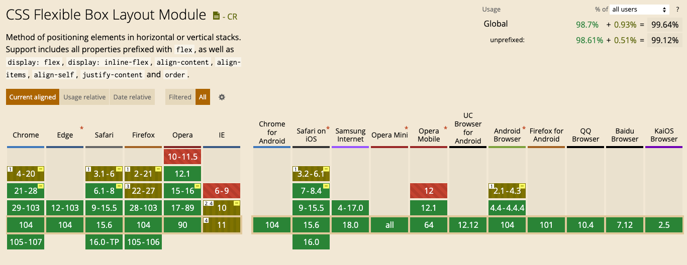
Browser Support
Conclusion
Grids can be your best friend when you need to create the outer layout of a webpage. With these, complex designs are not out-of-reach and responsive too!